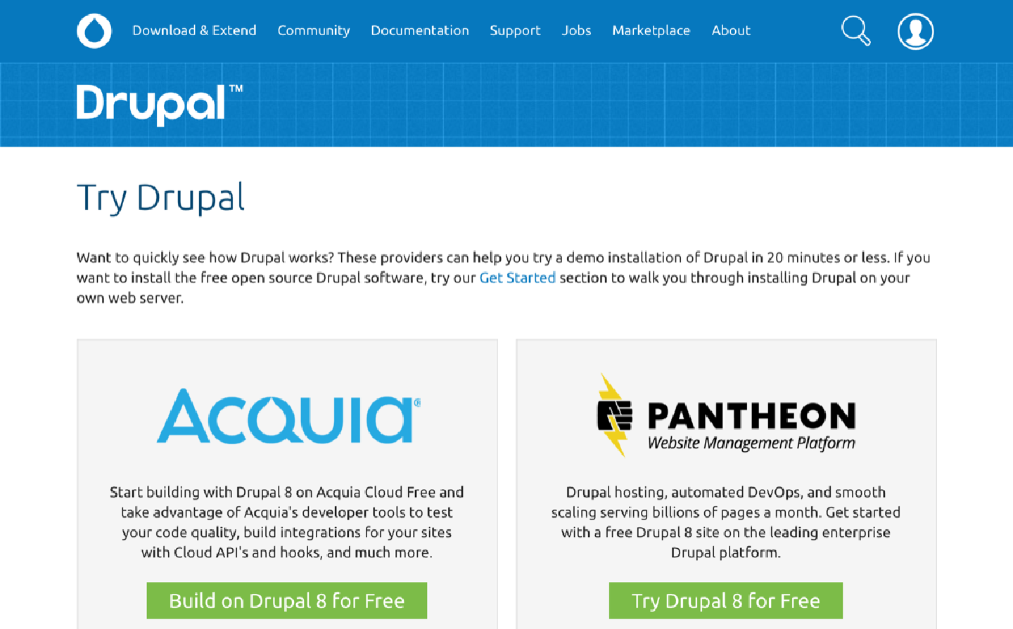
Trying Drupal
While preparing for my DrupalCamp Belgium keynote presentation I looked at how easy it is to get started with various CMS platforms. For my talk I used Contentful, a hosted content as a service CMS platform and contrasted that to the “Try Drupal” experience. Below is the walk through of both.
Let’s start with Contentful. I start off by visiting their website.
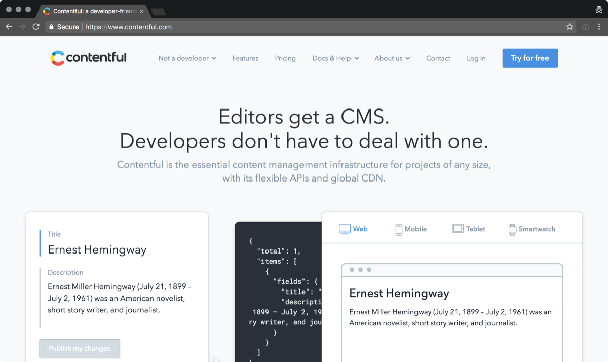
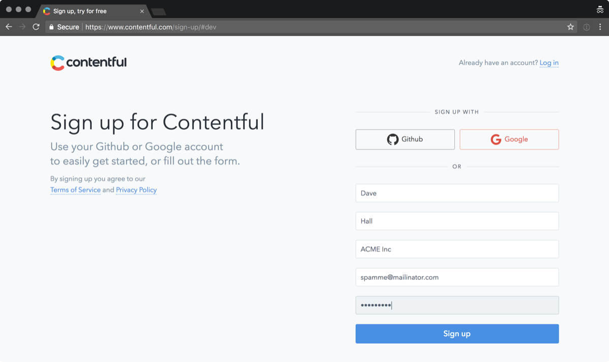
In the top right corner is a blue button encouraging me to “try for free”. I hit the link and I’m presented with a sign up form. I can even use Google or GitHub for authentication if I want.
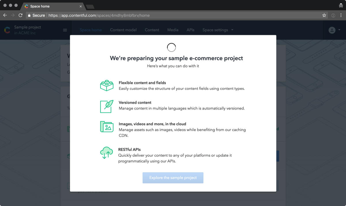
While my example site is being installed I am presented with an overview of what I can do once it is finished. It takes around 30 seconds for the site to be installed.
My site is installed and I’m given some guidance about what to do next. There is even an onboarding tour in the bottom right corner that is waving at me.
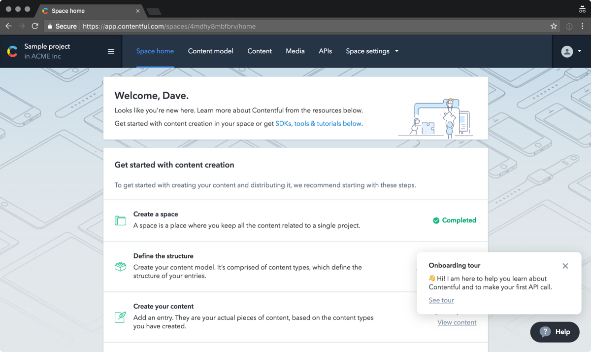
Overall this took around a minute and required very little thought. I never once found myself thinking come on hurry up.
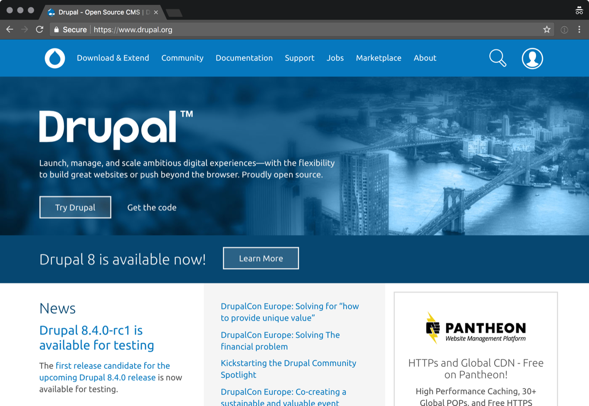
Now let’s see what it is like to try Drupal. I land on d.o. I see a big prominent “Try Drupal” button, so I click that.
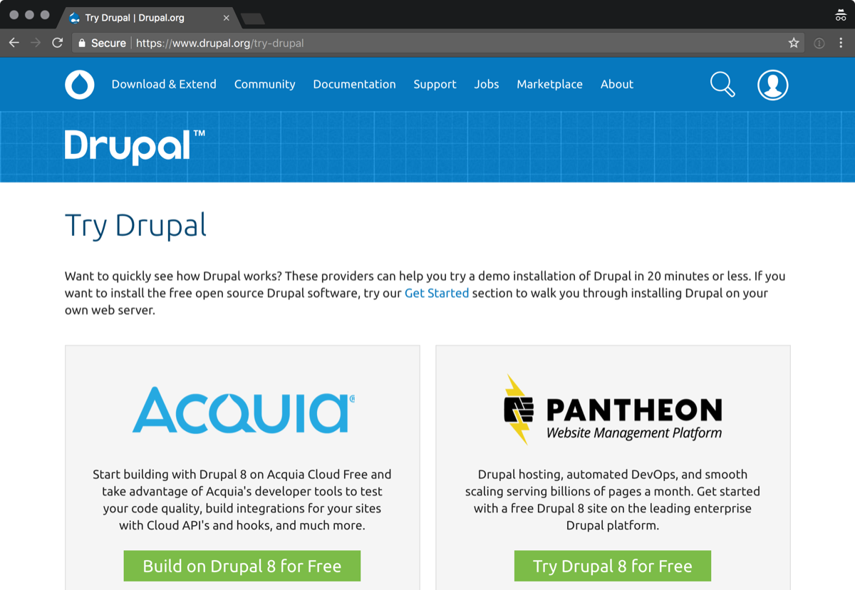
I am presented with 3 options. I am not sure why I’m being presented options to “Build on Drupal 8 for Free” or to “Get Started Risk-Free”, I just want to try Drupal, so I go with Pantheon.
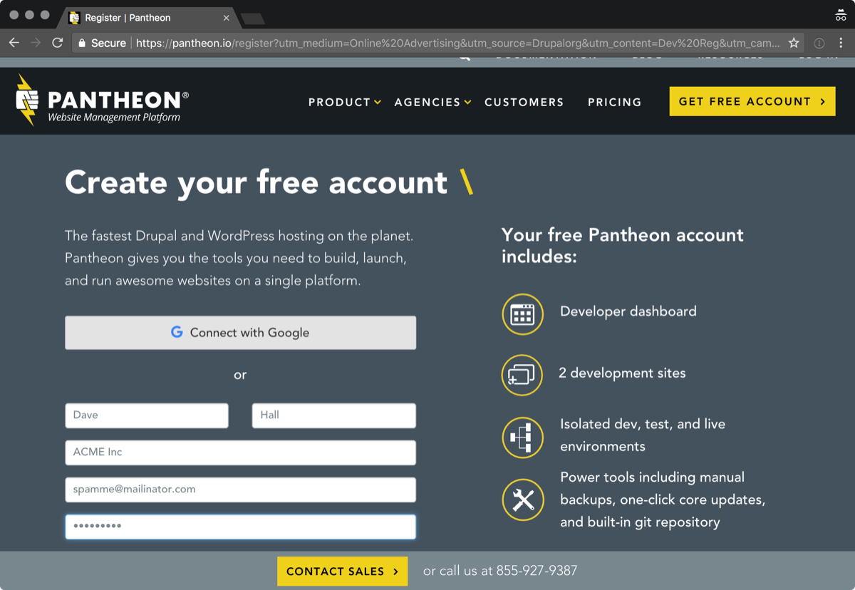
Like with Contentful I’m asked to create an account. Again I have the option of using Google for the sign up or completing a form. This form has more fields than contentful.
I’ve created my account and I am expecting to be dropped into a demo Drupal site. Instead I am presented with a dashboard. The most prominent call to action is importing a site. I decide to create a new site.
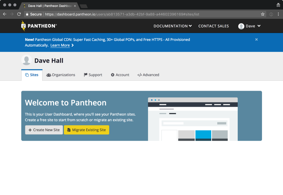
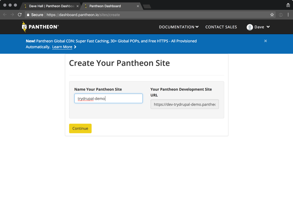
I have to now think of a name for my site. This is already feeling like a lot of work just to try Drupal. If I was a busy manager I would have probably given up by this point.
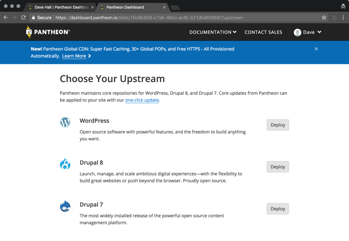
When I submit the form I must surely be going to see a Drupal site. No, sorry. I am given the choice of installing WordPress, yes WordPress, Drupal 8 or Drupal 7. Despite being very confused I go with Drupal 8.
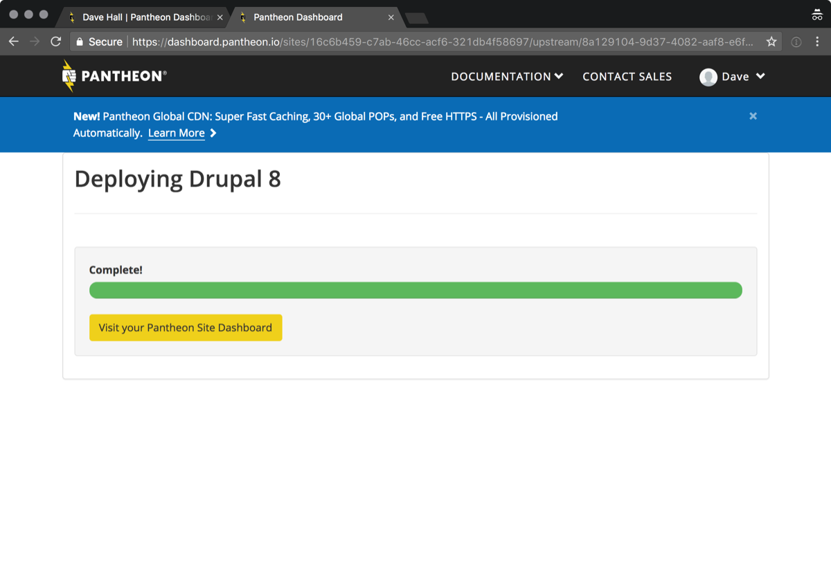
Now my site is deploying. While this happens there is a bunch of items that update above the progress bar. They’re all a bit nerdy, but at least I know something is happening. Why is my only option to visit my dashboard again? I want to try Drupal.
I land on the dashboard. Now I’m really confused. This all looks pretty geeky. I want to try Drupal not deal with code, connection modes and the like. If I stick around I might eventually click “Visit Development site”, which doesn’t really feel like trying Drupal.
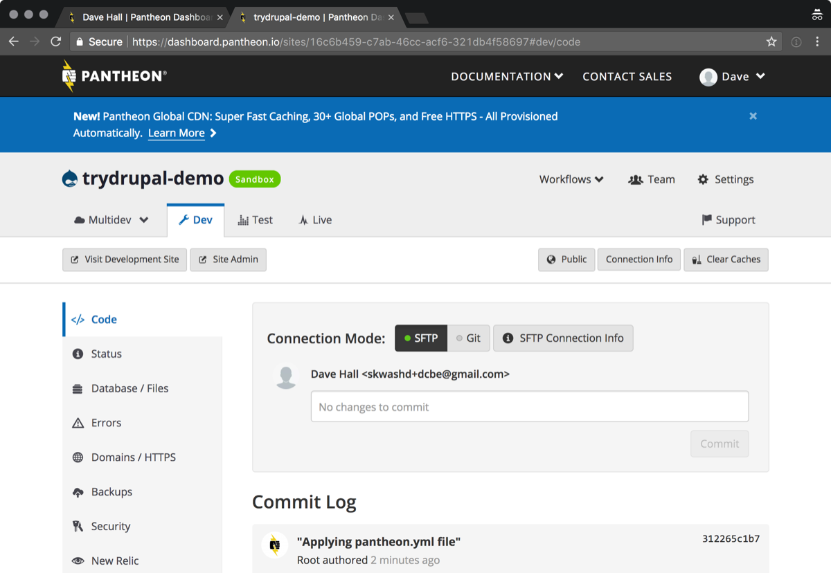
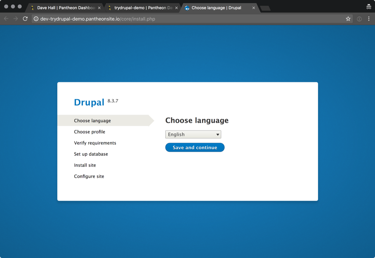
Now I’m asked to select a language. OK so Drupal supports multiple languages, that nice. Let’s select English so I can finally get to try Drupal.
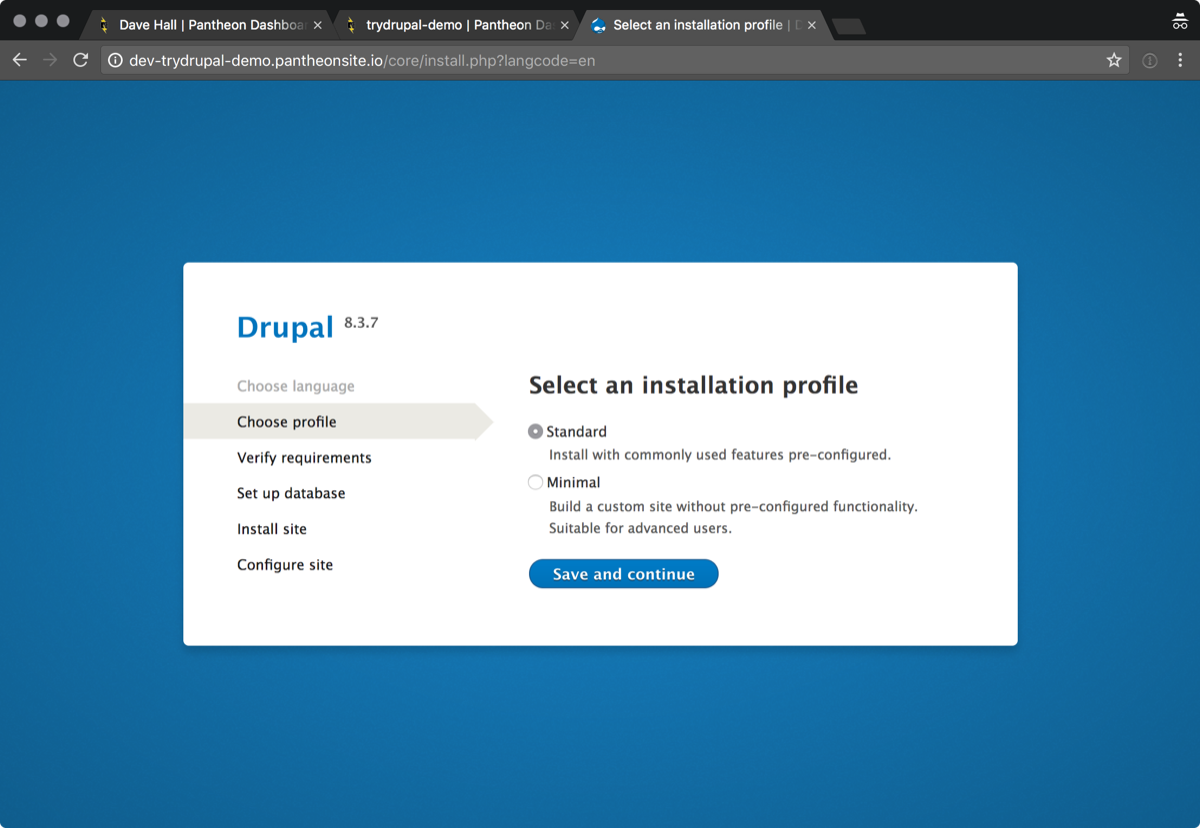
Next I need to chose an installation profile. What is an installation profile? Which one is best for me?
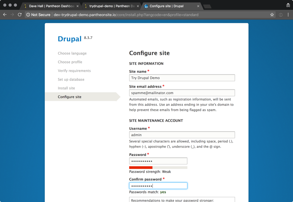
Now I need to create an account. About 10 minutes ago I already created an account. Why do I need to create another one? I also named my site earlier in the process.
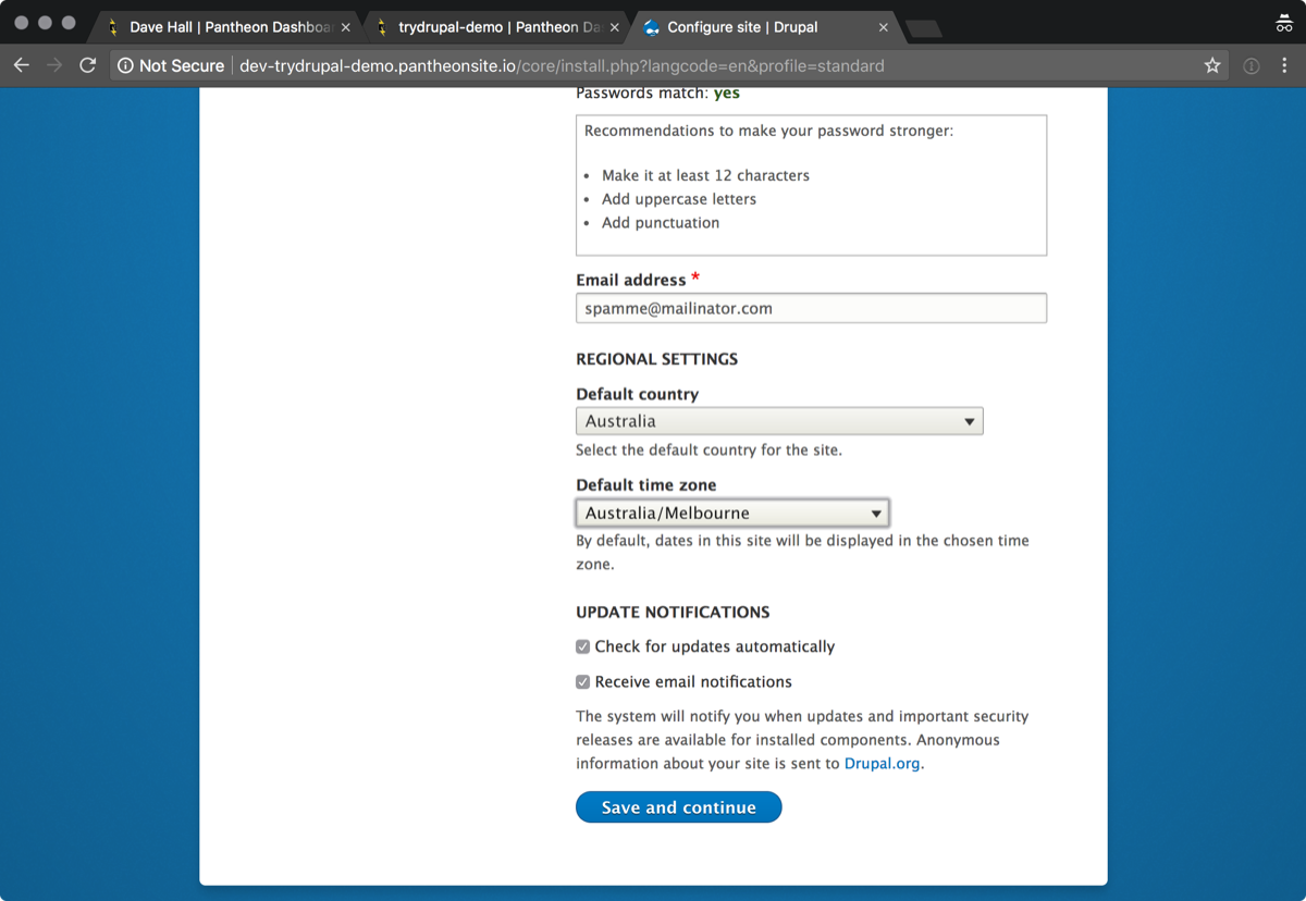
Finally I am dropped into a Drupal 8 site. There is nothing to guide me on what to do next.
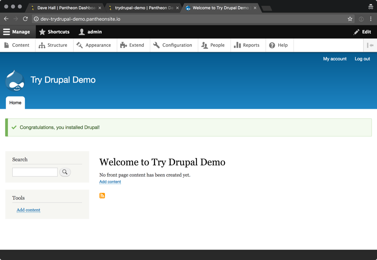
I am left with a sense that setting up Contentful is super easy and Drupal is a lot of work. For most people wanting to try Drupal they would have abandoned someway through the process. I would love to see the conversion stats for the try Drupal service. It must miniscule.
It is worth noting that Pantheon has the best user experience of the 3 companies. The process with 1&1 just dumps me at a hosting sign up page. How does that let me try Drupal?
Acquia drops onto a page where you select your role, then you’re presented with some marketing stuff and a form to request a demo. That is unless you’re running an ad blocker, then when you select your role you get an Ajax error.
The Try Drupal program generates revenue for the Drupal Association. This money helps fund development of the project. I’m well aware that the DA needs money. At the same time I wonder if it is worth it. For many people this is the first experience they have using Drupal.
The previous attempt to have simplytest.me added to the try Drupal page ultimately failed due to the financial implications. While this is disappointing I don’t think simplytest.me is necessarily the answer either.
There needs to be some minimum standards for the Try Drupal page. One of the key item is the number of clicks to get from d.o to a working demo site. Without this the “Try Drupal” page will drive people away from the project, which isn’t the intention.
If you’re at DrupalCon Vienna and want to discuss this and other ways to improve the marketing of Drupal, please attend the marketing sprints.